Ski Conditions App/Web
The Ski Conditions App/Web is a project that aims to inform users of the current ski conditions. Some of the main features are real-time ski condition reports, weather reports, and natural snow depth reports.
The Problem
Many customers are unsure or misinformed about the actual ski conditions at a resort. Ski resorts often make their conditions sound better than they really are to draw more skiers to their slopes. For skiers to truly know the conditions they need to keep track of what the weather has been like for the past two or more weeks. The goal of this app is to inform the user of the ski conditions.
The Solution
Provide skiers with easy access to current and historical weather reports, along with real-time updates on ski conditions. This information will help users stay informed about local ski conditions.
Temperature Change
Understanding the problem
Condition report from ski mountains
“light fluffy powder that fell consistently throughout the night! All trails were groomed overnight but expect the continuous snowfall to bring light powdery surfaces that will progress to packed powder.”
“Today you can expect to ski and ride down 61 open trails, with 56 of those trails taking on fresh stripes overnight.”
Reality
In reality, it downpoured rained then froze two times these last two weeks. With snow totaling to 2-3 inches.Many ski mountains do not give honest reports because they want to attract skiers. Unless a user has been paying attention to the weather for the past few weeks, it is tough for them to gauge the ski conditions.
Park City UT

North Conway NH

NOAA predicts significantly less freezing temperatures in in the United States. These two ski regions are one of the many areas that will see a significant drop in the next 70 years. This data shows that variable ski conditions aren’t going away. Warming temperatures mean less snow and a higher chances of bad ski conditions.
What are ski mountains saying?
User Journey
Going through the original path a user takes to figure out ski conditions, gave me insight into what information the user needs and what pain points they are facing. From the user journey, I got the idea to let users review the snow conditions on the mountain. This will provide honest and detailed insights into the ski conditions.
Understanding the user
Persona

Age: 40
Education: Bachelors
Hometown: Winchester MA
Family: Wife, Son, Daughter
Occupation: Sales
Sean has a family and wants to know the ski conditions because he doesn't want to spend much money if the ski Conditions aren't good.

Pain Points
Information:
Skiers don’t have enough information on the weather and conditions to make an informed decision. They don’t have information like access to past weather or current snow depth.
Time:
A lot of time is devoted to looking up different sites to figure out the weather and conditions.
Misinformed:
Many ski mountains aren’t honest about the conditions because they want customers.
Starting the design
Story Board

I created a storyboard to visualize how the user would successfully figure out the ski conditions. Creating this also helped me get an idea of the basic layout of the application.
Sitemap
This layout allows the user to get the information that they want quickly. From the start page, the user has the option to get mountain specific information or regional information. Keeping this information separate makes the pages easier to read while also providing clear information.


Wire Frames
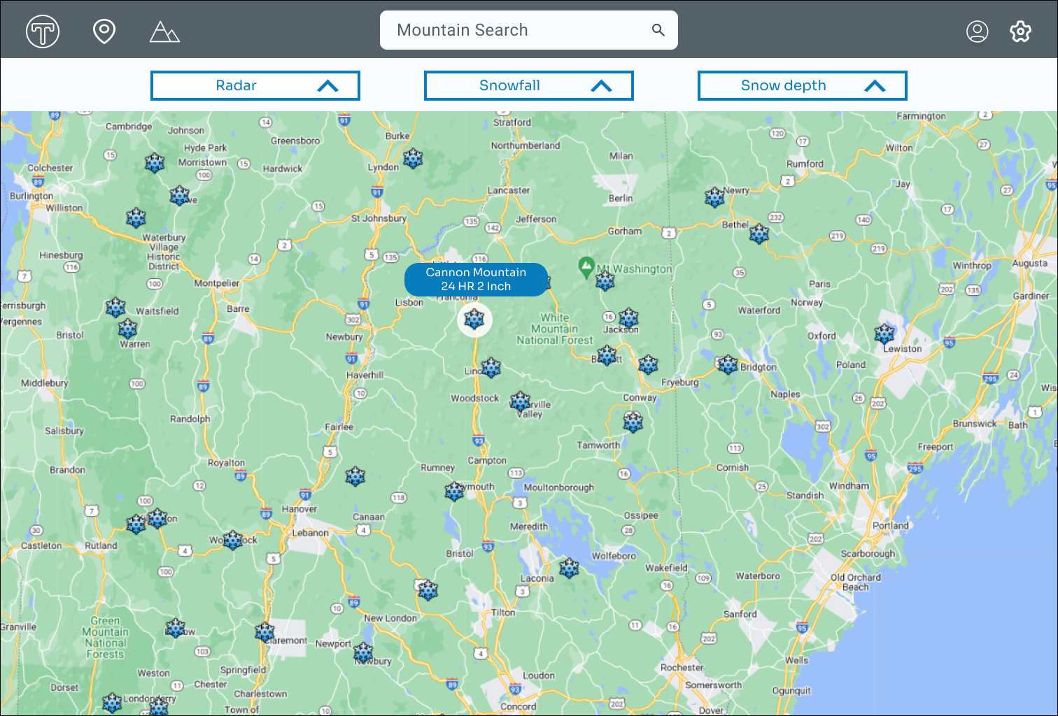
Adding large navigation cards helps the user quickly navigate to their region. Once the user clicks on a region, all the ski mountains will be shown on a map. The map design gives the user the ability to quickly compare the different ski mountain conditions. One of the goals was to save the user time. In order to achieve this I added icons and images instead of text to make the screens easy to read and navigate.
Color and Accessibility
I purposely chose Sora for its crisp, clean appearance, as it is a commonly used typeface. The colors blue, white, and gray were chosen to emulate those commonly found on a ski mountain. White and blue represent ice and snow, while gray symbolizes rock. Additionally, I ran a WCAG test to ensure the graphics, text, and background had high contrast for easy readability.


Prompt 1: Complete the signin process
Observations
Clicked on the guest option without much hesitationWas debating on whether to log in to google user or facebook
Prompt 3: Find the specific mountain Information
Observations
Seems to be taking awhile to find reviewFound the review quickly after finding the review section
Usability Study
Promte 1 Quote
" Seems like a straightforward signin process. I've done this many times for other websites."

Main Findings From Usability Study
Titles
Users have a hard time distinguishing filter titles. Filter titles need to be changed to be clearer for the user.
Grouping
Combining review and report elements into related groups will make it significantly easier for users to scan the page.
Information
New skiiers might not understand the language a skiier uses when describing ski conditions. Need to inform users what each ski condition term means.
Promt 3 Quote
"very informative page."
Usability Study
Participants
4 participants2 male 2 female
Methodology
8 minutes for participantUnited states, In PersonMoteratedUsers were asked to perform task on a low fidelity prototype
Prompt 2: Find the snow depth in the northeast region
Observations
Unsure of what filter to chooseRealizes that wrong filter option was selected
Prompt 4: Post a conditions review
Observations
Scanned conditions section for awhileNo stopages when posting a review

Userflow
Designing the user flow allowed me to assess the application's navigation and identify any potential bottlenecks. During this process, I realized that adding a hover feature to the regional map could provide users with a quick overview of the current mountain conditions. This enhancement has the potential to save users valuable time and improve their overall experience.

Promte 2 Quote
" Got a little confused when applying the filter. I was unsure if I should select snowfall or natural snow. "

Prompt 4 Quote
" I don’t understand what all on the conditions mean, but the process was straight forward."
Refining The Design
Web Design Changes

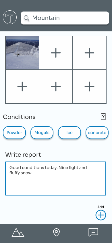
Adding a question icon will help explain each condition's meaning to the user. I added titles for each section to give the user a better idea of what they're looking at. Also combining the user review elements into one card helps give the page a cleaner look.
App Design Changes
Changing the title from 'Natural Snow' to 'Snow Depth' helps clear up the confusion users were experiencing when viewing the filter options. Additionally, an option was added to close the filter if the user decides not to use it.
High Fidelity Designs


Impact
Users thought that the app could be very informative. “ I liked how you can get an honest opinion from skiers on the mountain.”

What Learned
I learned that it is important to keep each feature's layout in mind. Also, to think about what the customer wants to get out of the experience when choosing a certain layout.
